Thursday, January 30, 2003
Weird Economy
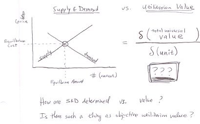
Is it just me, or do many market-dictated prices fail a "reality check" when compared against their true value or costs? Take gasoline, for example. You pay just a buck-sixty per gallon at the pump (in California), but when you consider everything that went into extracting, refining, and shipping it, that price just seems absurdly low. Widening the scope, consider the cost of maintaining a standing army and waging the occasional war in the Middle East to protect the assets of Big Oil. And the environmental costs exacted at oil fields, refineries, and on superhighways as a result of the life cycle of fossil fuel usage. Let's not forget that, from a value perspective, petroleum as a provider of molecular organic building blocks is irreplaceable. All the forgoing accounting makes the concept of paying a buck-sixty at Shell seem speechlessly ridiculous.
"It's all just supply and demand" parrot the economists. And they're partly right. But they're also partly wrong, as the absurdity of the petroleum example illustrates. What's missing is an understanding of where supply and demand curves themselves go wrong. My theory is that two assumptions of economics are violated to create wrong pricing: the assumption of rational behavior and the assumption of equilibrium dynamics.
Irrational perceptions on the supply and demand side cause their respective curves to sit either too high or low. Sometimes the real costs are vastly underestimated, as in the case of petroleum, and the seller is willing to produce at absurdly cheap prices. Alternatively, sometimes the value of a good or service is greatly exaggerated, causing an unjustified bidding war (as in the case of certain tech stocks in the late 1990's).
What causes irrational perceptions? My guess is that it's a combination of things. Information can be bad, it can be nonexistent, it can be difficult to get ahold of, and it can be incomplete due to an overly narrow scope. Human nature allows for sheer stupidity and sophist logic, emotional exhilaration or depression, and group/herd psychology. And some things are just damn hard to price. I'm thinking of making distinctions in an ostensibly homogeneous market (paying for excellent versus mediocre talent), accurately gauging causality (who creates success: management, marketing, or engineering?), considering matters of aesthetics (the strip mall versus the converted Hyde Park home), and assessing broad societal impact (such as air and water pollution).
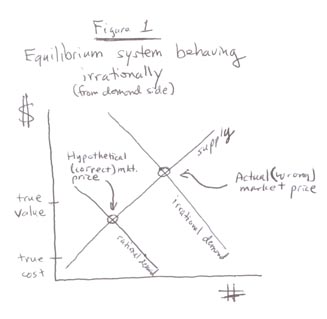
Figure 1 shows the effect that irrational perception can have on equilibrium pricing. In this case, irrational exuberance and herd psychology have caused the demand of a certain type of technology stock to be significantly higher than the stocks' true value. In the oil case mentioned above, the supply curve is vastly underestimated, putting equilibrium pricing below the true cost.
The second main trip-up with supply and demand curves is the dirty little secret of freshman macroeconomics: many systems don't actually operate in equilibrium. In a perfect world, supply and demand sides would be able to anticipate each other, leading to the nice charts with intersecting curves. But the reality is often far removed from this ideal. It's hard to predict the future, to know what will "hit" and "miss" before they actually do, so we are often wrong when we try. Also, we are a species that tends to be risk-averse when planning college majors or semiconductor FABs; when in doubt, we let demand lead and supply lag.
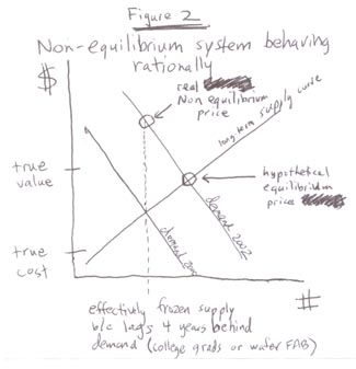
Figure 2 shows non-equilibrium mechanics at work. Not only is there is no intersection of curves, there really isn't a curve at all because many things are inelastic in their supply, at least in the time scale of shifty economic trends. Think housing in the San Francisco Bay Area or the number of college-educated engineers. In the first case, there's only so much land to build on, leading to absurd home valuations when demand surges. In the second case, an effectively static population of engineering talent is the result of a 4-5 year time lag between when an upward demand signal stimulates college enrollment and that graduating class enters the workforce (by which time the demand incentives may be long gone).
Non-equilibrium is the inherent state of high-tech because by definition it is a system that is always in a state of flux and uncertainty. Ironically, it is precisely this unstable cycle of shortage and surplus that generates the large amounts of wealth associated with technology. You take risks, you stand to collect huge gains. If you want stability (read: equilibrium economics), find another line of work.
Much of the economic unrest in history is the result of irrational distribution of wealth, which is closely related to the value we assign to goods and services. It has been behind every major revolution and I'm convinced it is the root cause behind our current obsession with Iraq. How do we solve the problem of bad market pricing?
Several alternatives have been advanced over the years, but none of them have turned out to work in practice. The most spectacular failure was Communist Russia, who opted to eliminate the supply-and-demand mechanism in favor of an ostensibly more rational central price-fixing program. Germany tried a less-drastic method of closely regulated business development. And the US government practices its own limited interventions into monetary supply and product markets, much of it actually causing more harm than good.
But really what it all comes down to is that it's up to us - the players - to get our act together and start behaving rationally. Maybe that means paying more for gas and less to CEO's. Maybe it will require a blood revolution. I don't know. What I do know is that we need to get back to appreciating what things are really worth instead of bidding prices up or down under the false security blanket of "it's just the market." Yeah, it's just the market. But guess what? The market starts with you, buddy.
posted 12:47 AM | 0 comments
Thursday, January 23, 2003
Widescreen: when more is sometimes less
1. 35mm camera, spherical lens (non-squeezed) photography for theatrical presentation. (Sound area blocked) (Figure 1).
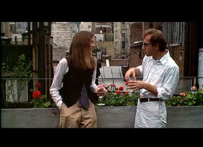
Just a heads-up for those who believe that widescreen transfers reveal more of the movie than full-screen versions: it isn't always so. There are actually two main types of widescreen: flat (1.85:1 or 1.66:1 for European screens) and anamorphic (2.35 or 2.40:1). When movies are filmed "flat" using regular spherical lenses, a widescreen aspect ratio is achieved by vertically masking the full-screen Academy frame during projection, thereby hiding approximately 27% of the original image on the print. Most movies are made this way, Annie Hall being a good example. Notice how the widescreen DVD cuts off the Manhattan skyline and the principles' legs compared to the full-screen version:
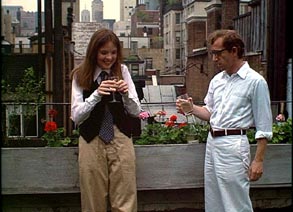
The ASC Manual describes this process in the first couple of pages as follows:
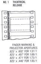
The ANSI standard calls for cameras for nonanamorphic photography to be equipped with an aperture of 0.864" by 0.630" minimum. Many cameras, however, are equipped with apertures which will cover the area required for anamorphic images as well, and it is occasional practice to use a "hard matte" to limit the area in the vertical dimension to the wide screen format desired by the director. It should be understood, of course, that while the use of a hard matte insures correct framing in the theatre, it also limits the future use of the image for television releases in 1.33:1 aspect ratio....
Other films are shot using the anamorphic process which employs special lenses that horizontally squeeze an extremely widescreen image onto the regular full-screen Academy frame. These movies achieve an aspect ratio of either 2.35 or 2.40:1 (depending on whether regular or Super35 is used) without using masking. Therefore, when full-screen transfers are made, the image must be horizontally lobbed off to accomodate the stouter aspect ratio. In Tootsie, notice how the cooks in the kitchen were killed by the pan-and-scan:
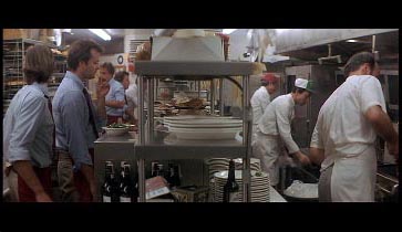
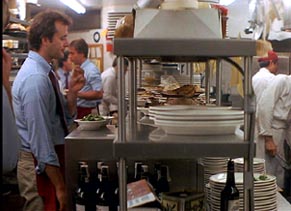
The ASC Handbook spells this process out in greater detail:
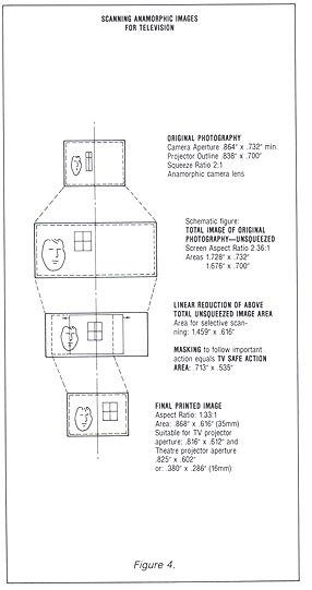
4. 35mm Camera, 2:1 anamorphic lens (squeezed) photography for theatrical presentation. (Panavision and Todd-AO 35) (Figure 3)
A. 35mm contact or 1:1 prints.
For this system, cameras are equipped with anamorphic lens attachements which compress the image horizontally in a 2 to 1 ratio, resulting in a lens field twice as wide as would otherwise be photographed with lenses of equal focal length. Prints from negatives photographed in this system must be projected in the theatre with anamorphic lenses. At least in the United States, for all practical purposes, all theatres are so equipped.
Because of the aspect ratio and the anamorphic squeeze, direct prints from this system cannot be run on television. In most instances a 1.33:1 aspect ratio extraction from the center of the screen loses significant action. It is therefore necessary to "scan" the image to follow major action in the preparation of a duplicate negative from which television prints may be made. The accompanying diagram shows this transition. A number of optical houses are prepared to supply this type of duplicate negative, either in 35mm or 16mm. (Figure 4)
And don't go looking for a widescreen version of Full Metal Jacket, or many of Stanley Kubrick's other films. They don't exist. Even though he would agree to exhibit his pictures in the standard 1.85:1 theatrical aspect ratio, he loathed the format and demanded that all subsequent video releases (with a couple of exceptions) show the full-screen Academy image as he composed it. Kubrick's longtime associate Leon Vitali summarized those reasons in an a recent interview:
The important thing to know about Stanley, is that he wanted all of his films shown on video - anything that wasn't a theatrical presentation - in the original camera ratio that he shot it in. He wanted you to see the films exactly as he saw them when he looked through the camera lens and composed them on set. He was no fan of 1.85, because he felt that you were losing part of the image he composed.
What's interesting in all this is that I've found that many "flat" films look substantially better in their full-screen format, perhaps becuase the cinematographer is subconsciously framing for the full Academy frame even when he knows that it will be masked down during projection. As an aspiring indie filmmaker, I've found the same rule to hold for shots I've consciously composed on 16mm for widescreen. When viewing the footage afterwards, the image looks fine with the letterbox masking, but opens up nicely without it.
When watching anamorphic widescreen movies, however, I think you absolutely need a widescreen transfer in order to preserve any semblance of artistic cinematography (let alone plot and character information). In this case, letterboxing truly gives you more than full-screen.
I used to be a widescreen DVD nazi but have since softened as I've learned more about the way movies are made. It's amazing how dangerous a little bit of knowledge can be, how an incomplete set of facts can represent a nightmarish minefield between sheer ignorance and nuanced understanding. As a citizen occupying that middle ground of knowledge, I've oftentimes made incorrect assumptions that led to intensely-held positions. And all for nothing. Goddamn pseudo-expertise in all its incarnations!
But I know better now. I now know to consider each film on a case-by-case basis before making a judgement call on the prefered exhibition format. When I watch flat films, such as Annie Hall or Vanya on 42nd Street, I like to use the full-screen editions. When I watch anamorphic films like Tootsie or American Beauty, I prefer the widescreen transfers. As in any complicated system, no hard and fast rule applies to everything; the correct answer to most questions is that it all depends.
posted 11:39 PM | 0 comments
Friday, January 17, 2003
Lonely Friday
The last few hours of work felt more like a Cheers or Taxi episode than anything else. I went downstairs to my writings system test area thinking I would just checkup on everything before going home and instead wound up hanging out with my operators until seven. The topic of conversation: how to get me to be more social.
So Dave, Fred, Bobby, and Derek alternatively offered their opinions on where I should go to meet people in San Diego. Pretty much, they recommended various clubs. Dave is into synthpop and industrial music, so he gave me his shortlist of places to hang out. Fred mentioned some good places to go for ambient and trance, and Bobby and Derek just joked around about gay clubs and cheesy drunken frat hangouts.
It was such a cozy and friendly setting, the five of us hanging out in our own little corner of HP. I really love my operators. I love owning my own little part of the factory and having my crew to work with. They're great.
They're also temporary employees who will eventually be leaving in a few months as dictated by their agency contract. As I walked out to my car afterwards, I wondered if I'll try to stay in touch with Dave (who I especially like) after he's gone off to work other jobs in far-away reaches of the city. Probably not. That thought suddenly made me really sad, a feeling that even a pot of really good Peet's coffee and my Best of Muddy Waters CD on infinite repeat has yet to dispel.
posted 11:21 PM | 0 comments
Tuesday, January 14, 2003
Power Content Label
As it came with my electric bill today.
Energy Resources / SDG&E Power
Eligible Renewable / 12%
Coal / 11%
Large Hydroelectric / 10%
Natural Gas / 50%
Nuclear / 16%
Other / < 1%
Total / 100%
I would have thought that coal would be the largest piece of my electrical pie, but it appears that natural gas takes the honors. Somewhere out there, I'm sure Arley's smiling.
posted 12:15 AM | 0 comments
Monday, January 13, 2003
The Case Against Big Fat
Anthony Sebok, professor of Law at Brooklyn Law School, has a nice biweekly column in FindLaw's website. In a pair of installments from last year, he neatly addresses the arguments that may be invoked against Big Fat in the now-notorious class-action lawsuit filed by a Bronx resident (Caesar Barber) who claims that eating fast food made him fat. I read both of the columns, thought about it a bit, discussed with my law-school friends, and finally decided to present my view of the case.
1. Product Defect
This is the concept that a product, either by dint of manufacture or design, is defective and the original creating company is culpable for damages inflicted by the use of the product. Both in the case of Big Tobacco and Big Fat, manufacturing defects are not the issue, however. It is the question of a design defect.
At first glance, design defect seems like an excellent argument against Big Fat. Fast food is clearly engineered, meaning that it is eligible for consideration as a designed product. Unlike a steak, a Big Mac has very specific composition that was determined by McDonalds to have certain desired taste characteristics, even at the expense of nutritional value. Given that the primary purpose of food - even fast food - is arguably nutrition, McDonalds food is arguably defective in its design.
The problem with the design defect argument is that most states require that a safer, alternative design (that has identical function and meets the original purpose of design) be presented in order to make the charge stick. If such an alternative design cannot be found, the design is said to be manifestly unsafe, meaning that it is not the company's fault that the product is dangerous - it's the fault of Mother Nature.
What is a clearly superior alternative to the Big Mac that will still satisfy the original design parameters of optimal taste and ease of preparation? A gardenburger might be offered up as an alternative, but will juries agree that it is an adequate replacement to the beef patty? What about the French fry? They could be baked instead of fried, but then it wouldn't be a "fry," now would it? Isn't fat and sugar and salt the whole point of fast food in the first place?
I say that, but some interesting counter-evidence that could be presented would be McDonald's own redesign of the French Fry a few years back, when consumer pressures demanded that they switch from using beef tallow to vegetable shortening as the cooking fat. The problem was, while customers hated cholesterol, they also loved the taste that beef fat gave the fries. What was to be done?
After a few years of R&D, McDonald's found that the beloved beef fat taste derived from a complex assortment of aromatic compounds that naturally occur in beef tallow. By extracting those compounds from beef tallow and adding them to vegetable shortening, an adequate and nearly indistinguishable alternative to the original frying recipe was formulated and implemented at all McDonalds stores nationwide. Most customers never knew the difference, except that now McDonalds signs all advertised "100% Pure Vegetable Oil Used."
To the extent that it can be argued that McDonalds has failed to extend this level of product design improvement to their entire line of fast food offerings, design defect may successfully be invoked to hold Big Fat culpable for the poor health of its customers. I suppose the next step that McDonalds could have taken with the Fry would have been to investigate alternative preparation methods (as I half-joked above). They could look into using fat substitutes. They could try baking or roasting or a more benign version of frying, or even some strange combination of all those in order to come up with a drastically healthier alternative to their current French fry.
Of course, the slippery slope argument starts to creep up with this approach. At what point is it okay for McDonald's to stop R&D on healthier BigMac and fries, arguing that they are "manifestly unsafe designs" outside the realm of design defect? And does McDonalds have to conspire with all the other Big Fat corporations in order to force consumer choice towards safer designs? Doesn't that start to sound like product censorship?
The tobacco plaintiffs tried to invoke design defect reasoning when they presented evidence that Philip Morris in the late 1970's had developed a less carcinogenic cigarette (that contained, among other things, a miniature catalytic convertor at the filter stage made out of palladium catalyst) and at the last minute decided not to market it for fears that it would imply that regular cigarettes were dangerous. The plaintiffs lost that argument because it could not be shown that even if the better cigarette were available, the plaintiff would have chosen to smoke them.
2. Failure to Warn
This is the familiar concept that Big Fat failed to disclose known risks about the consumption of fast food to customers.
The problem with Failure to Warn is that just about everyone knows that fast food is bad for you. However, it could be argued that fast food restaurants need to label their food with the equivalent of the FDA's Nutrition Facts box currently found on the side of most supermarket products, or alternatively a warning similar to those found on cigarette boxes ("Warning: The surgeon general has found that the consumption of hamburgers can lead to clogged arteries, increased risk of Alzheimers, and general obesity."). The presence of these labels on food and tobacco products could be thought to have created a reasonable expectation that risks of fast food consumption be disclosed by Big Fat.
By the way, in the case of Big Tobacco, Failure to Warn has consistently lost as a primary argument against cigarette makers for the same concerns I mention above. Everyone knows that smoking is bad for you and each pack you buy contains a warning on it and has for decades. Instead, what has gotten Big Tobacco into trouble is ...
3. Fraud
This historically has taken two forms in product liability torts: flat-out lying and targeted advertising.
The flat-out lies are where Big Tobacco fell: they deliberately lied on the witness stand over decades of cover-ups and misleading press releases. However, Big Fat has never gone on the record the way that Big Tobacco did in Congress years ago, and nobody thinks that McDonalds would ever argue that a steady diet of Big Macs wouldn't cause heart disease, anyway.
Besides, the law only allows for damages to be awarded if the plaintiff can show that they actually relied on the faulty information presented to them to make a damaging personal decision. In the case of Big Tobacco, it isn't clear that smokers believed the lies they were being fed by the cigarette makers and that that caused them to pick up or continue smoking. The dangers of smoking are so well known and widespread that it is hard to accept that Big Tobacco's lies persuaded anyone.
When it comes to children, who don't have the rational powers of fully formed adults and who are especially vulnerable to societal pressure, fraud in the form of targeted advertising is entirely tenable. For decades, cigarette makers equated certain things - money, fun, sex, health - with smoking in their ads, clearly misrepresenting the facts as they knew them to be. Big Fat could similarly come under fire for their ads that attempt to hook kids on fast food.
Hook? As in addiction? Yup. One of Sebok's most brilliant points is that advertising can create addiction. Indeed, one of the cornerstones of modern marketing theory is that advertising is literally the creation of needs and wants, not just the broadcasting of the relative merits of competing products. Through the miracle of the magazine spread and television spot, Gillette invented the market for disposable razors, General Mills the market for sugary breakfast cereal, Big Tobacco the cigarette, and now Big Fat will come under fire for convincing millions of American children that what they really need more than anything else is a Happy Meal. While "freedom of choice" gets touted as an argument against the effectiveness of advertising, Sebok argues that the raw statistical data do not support that hypothesis. And it is hard not to believe him: after all, why would companies continue to advertise if they didn't get clear results from it?
The FDA has long struggled with a technical definition of addiction and failed. Sebok recommends that we consider something addictive if: "the substance, in the environment in which it is used, produces unhealthful consequences that the individual with a desire to stop them, nevertheless cannot stop." On that count, advertising could be held culpable for creating certain addictions, such as those for fast food. But whether tort court is the right venue for righting that broad, societal correlation is questionable. The problem with leaving it up to the politicians is that they also fall prey to another correlation: namely, that they will do whatever the corporations want them to, irregardless of societal good. It is hard to trust them with the task of making addictive advertising illegal.
So, for now, perhaps the best thing to do is to let the tort courts handle the question of how advertising creates addiction. Maybe if enough plaintiffs win cases, our lawmakers will get the message and put restrictions on addictive advertising methods.
----------------------------------------------------
I think Sebok has successfully argued that the class-action suit pending against Big Fat has legal merit, especially as fraud in the form of targeted and deceptive advertising. I think even the design defect theory may be successfully argued up to a point, although the slippery slope analogy might lead to an undesirable legislative censorship of manifestly unsafe designs (such as the Big Mac and the Marlboro Red).
In either case, it is clear to me that corporations deserve to start standing trial for manipulating societal forces that create pressures and addictions, rather than continuing to hide behind the false veil of "freedom of choice." In many ways, people today make choices that are far worse than those they made a century ago, and a lot of it is due to evil marketing practices. That holds even though people in the 21st century are better educated and sophisticated (and cynical) than ever before. Those who would argue for personal accountability miss the point. No matter how hard we try to tell our kids and ourselves otherwise, we still want our Fruit Loops and Big Macs. I blame advertising and the corporations behind the vast and unimaginable strategies to sell us things that we not only don't need, but are ultimately bad for us. Because they help create the addictions, they should be judged for them.
posted 1:06 AM | 0 comments
Friday, January 10, 2003
Morphing Corporate
These are just plain fun. Enjoy.





posted 3:07 PM | 0 comments
Wednesday, January 08, 2003
Goodbye, Connie
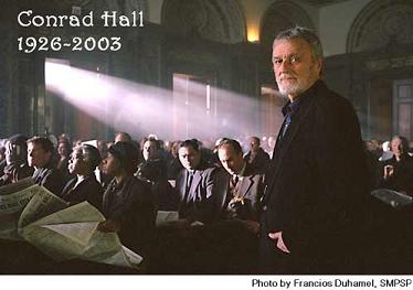
Conrad Hall, grand master of cinematography and my hero, is dead at 76.
To see any of his films is to appreciate his artistry; to imagine the field of motion picture photography without him is impossible.
The opening sequence of Butch Cassidy and the Sundance Kid, shot in faded sepia tones, immediately transports you back to 1900; the "Raindrops Keep Falling on My Head" sequence will take your breath away, even on the tenth viewing.
Who can forget the shafts of late-afternoon light coming in through the windows of the New York chess club, falling across the board where Josh Waitskin is being taught by his teacher, in Searching for Bobby Fischer? Who among us was not completely awed by the stadium sequence of American Beauty, where Lester Burnham falls in love with his daughter's best friend?
Road to Perdition, his last, was yet the best of Conrad Hall's oeuvre. Every frame is arresting, an Edward Hopper-esque vision of father and son making their way across the great American landscape. Watching it, you feel as if you're witnessing visual perfection, the apex of an elusive craft borne from years and years of practice. It is the most beautiful thing on celluloid I've ever seen. It's partly why I want to become a filmmaker.
Sam Mendes, director of both American Beauty and Road to Perdition, says he's devastated by the news. And so am I. There will be more Sam Mendes films, but none of them quite as magical as those made with Conrad Hall's hand on the camera. Part of what keeps a filmmaker or musician or writer going - his fuel, so to speak - is inspiration. And now that Conrad Hall is gone, there will doubtless be less of it.
posted 11:21 PM | 0 comments
Sunday, January 05, 2003
The Big Hit
I've been in a serious funk the past month, dealing with monumental depression that has devestated my social function, thought, writing, and supply of clean laundry. What brought this on is anybody's guess. Maybe it was seeing my uncle dying in the cancer ward of the county hospital in Houston right after I arrived home for the holidays. Or maybe it was something far less dramatic: something I ate, a movie I saw, a line I overheard at a party, something I read? I don't know. Maybe a combination of the above. But whatever the reasons, I've just felt like crap and have had a hard time getting out of bed in the morning. What's wrong?
I was discussing this with my dad sometime last week and one of the arguments I made was that it's been a long time since I've had a hit. What? Yeah, that was his reaction, too. But you know what I mean: a hit. Something that proves to yourself and the world that you're of significant existential value and not just an interchangeable cog in some politico-socio-economic machine. Something original, beautiful, profound, clever. Something that could only come from you, no matter how small: an email to a beloved friend; a new theory; a performance of a Bach sonata; a 5-minute movie.
When you make something beautiful, you feel beautiful. When you do something original, you feel smart. Creation is a form of self-validation. I'm sure some folks are just happy to believe in their goodness as a matter of religious conviction, but I demand proof: what have I created today to account for myself? What foundation can my self-confidence stand upon?
I don't know about other people, but making things is a necessary component of my self-definition. Reading other people's writing and watching their movies is all good and well, but it tends to induce in me a schizophrenia that changes orientation with each new book or DVD. It is only by taking those influences and making something new that I define where I stand and where I want to go. Without creation, existence just feels like an identity crisis with destination nowhere.
The converse is true: creation is very difficult in the face of an identity crisis. In fact, creation and identity are so inextricably bound together that I find that when one begins to falter, the other follows close behind. A man who doesn't know where he wants his life to go has a hard time directing his prose towards an agreeable ending, and vice-versa. And so when depression strikes, a downward spiral of the creation/identity duality ensues until I find myself where I am now.
The only reason I'm telling you all this is not because I think you care. I'm not that pretentious. I've seen my Humphry Bogart. If the problems of a few little people don't amount to a hill of beans, then those of a single person must certainly ring up as something far less. No, this entry is for me. Because I haven't posted a damn thing here in over a month. Because I need to kick myself out of this stupid void of nothingness I'm in and get back to making things.
I suppose it all comes down to a matter of faith, something not lost to observers of the religious holidays. Absent a solid portfolio of recent successes, I'm just going to have to assume that I'm up to the task of making a hit. I have to assume that the article or movie or book on my coffeetable is worth exploring, that I won't run out of interesting influences, that I can eventually channel them into something new and worthwhile to show the world.
So here's to a creative 2003. Thanks for reading this space in the past year. And let's see who I become this time around.
posted 8:59 PM | 0 comments